As autumn arrives and the days grow shorter, our homes naturally become the places we seek out for comfort. This is the season for soft blankets, steaming cups of tea or coffee, and rooms that feel calm and inviting.
Colours play a big part in creating that warmth. A palette is simply a group of shades that work well together, and choosing one can take away much of the uncertainty. It helps every cushion, rug, curtain, or lamp connect gently, giving the whole room balance.
The aim isn’t perfection; it’s about creating a space that feels like it welcomes you in from the chill outside.
*Article Podcast (Listen Option):
Autumn Trends 2025: What’s Popular
This year celebrates natural and honest materials. Oak tables, linen curtains, wool throws, and matte ceramics are appearing in many homes.
Popular shades include ochre, rust, and olive green, which sit beautifully with calm neutrals such as cream or beige.
Metals are moving towards softer finishes too, with brushed brass and antique gold adding a gentle glow to frames and candle holders. Greenery such as eucalyptus, olive branches, and dried grasses remains popular, bringing life to rooms.
These touches are simple yet effective, and they can continue into Christmas with a little sparkle, or into spring with lighter fabrics and fresh flowers.
Share This Post:
Lighting is also key.
Bright overhead bulbs are being replaced by softer options such as fairy lights, shaded lamps, and lanterns. These create gentle pools of light that make you want to linger. You don’t need to change your whole home to feel the effect. A few candles in brass holders, or a small vase of dried flowers, can bring that seasonal glow almost instantly.
Why Colour Palettes Matter:
Choosing colours can feel difficult.
Too many, and the room may look muddled. Too few, and it might feel flat.
A palette provides a gentle guide. It doesn’t limit you; it encourages you to repeat colours across textures so the space feels harmonious. You’ll notice the same shades reappearing in a cushion, a rug, or a piece of art.
That repetition makes the room feel intentional.
When looking at the images of the palettes, pay attention to what catches your eye. Is it the texture of the blanket, the way the light softens the space, or a piece of wall art? Think about what makes you feel good, and use that as your guide.
Video Version:
Simple Decorating Tips:
- Start with a neutral you already own, like cream walls, a beige sofa, or a taupe rug.
- Add two autumn colours you enjoy. Let one be the main accent and the other a supporting detail.
- Follow the 60/30/10 rule: 60% neutral, 30% secondary colour, 10% accent.
- Repeat colours at least three times, perhaps in a cushion, a vase, and a throw.
- Check colours in different lights such as daylight and evening.
- Focus on textures if unsure. A wool throw, a wooden table, or a ceramic bowl can often provide as much impact as another colour.
- Make small swaps like new cushions or a table runner to bring in the new season.
Our Core Autumn Palettes:
Here are five autumn palettes, each with decorating ideas, seasonal tips, and things to notice when you look at them:
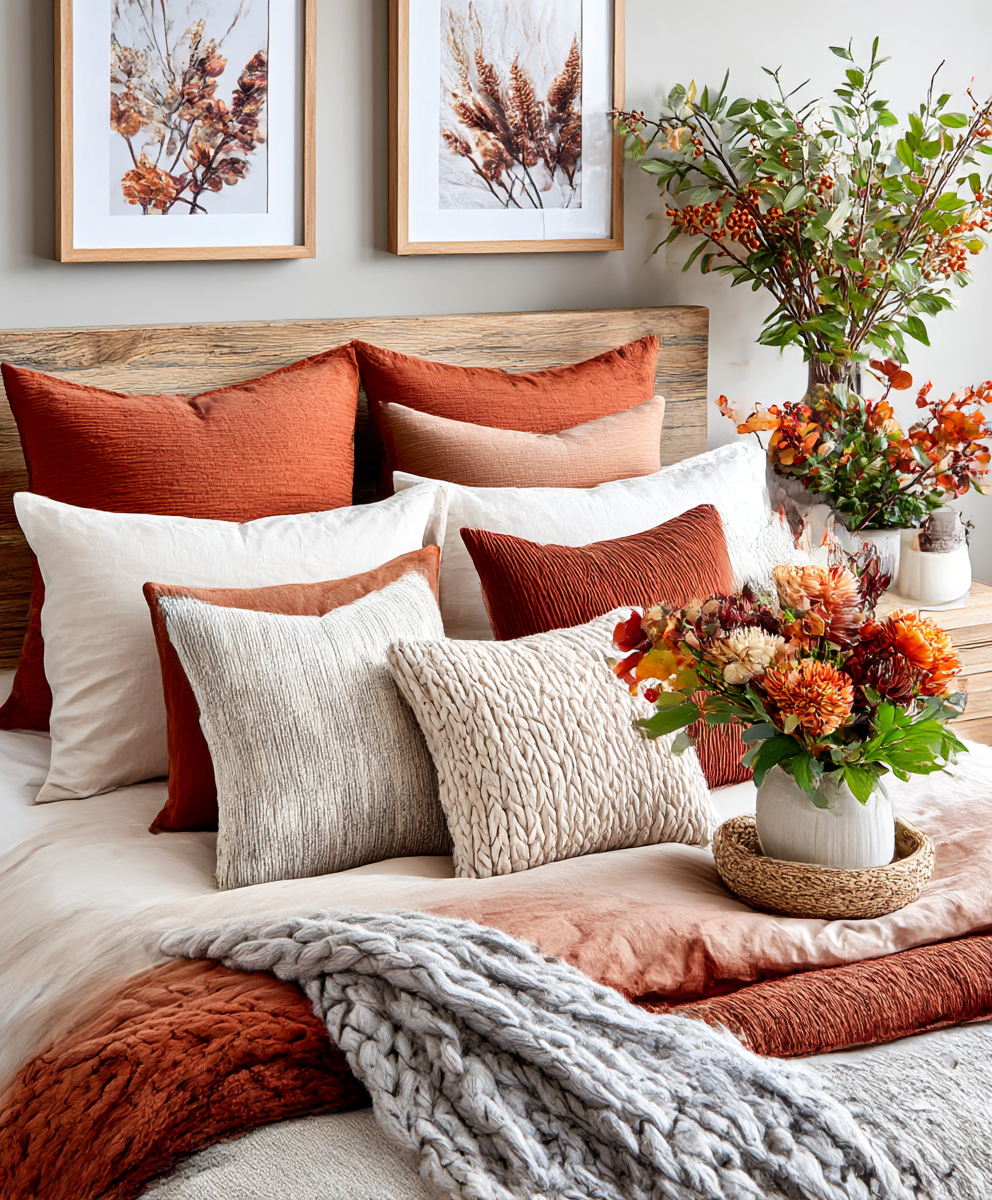
1. Rustic Warmth
-
Colours: burnt orange, terracotta, deep rust, warm beige, dark wood
-
Best for: homes with wooden floors and neutral walls
-
How to use: add terracotta cushions, a rust throw, and keep beige as your base. Layer chunky knit blankets and matte ceramics.
-
What to notice: see how the warm tones rest against natural wood and soft fabrics. Notice whether it’s the texture of the knits or the richness of the colour that makes you feel cosy.
-
Seasonal updates: beige and wood work all year. For Christmas, add deep reds and golds. In spring, move towards soft clay and greens.
*Rustic Warmth* Mood boards:


Interiors in *Rusty Warmth* Colour Palette:


*Love the colours we are sharing? Use our *Free Colour Picker* tool to help you determine the colour code, and our *Free Paint Calculator* to help you plan wall paint quantity.
For finding similar products featured in our image, use Google Lens, available free to everyone on Google Chrome.
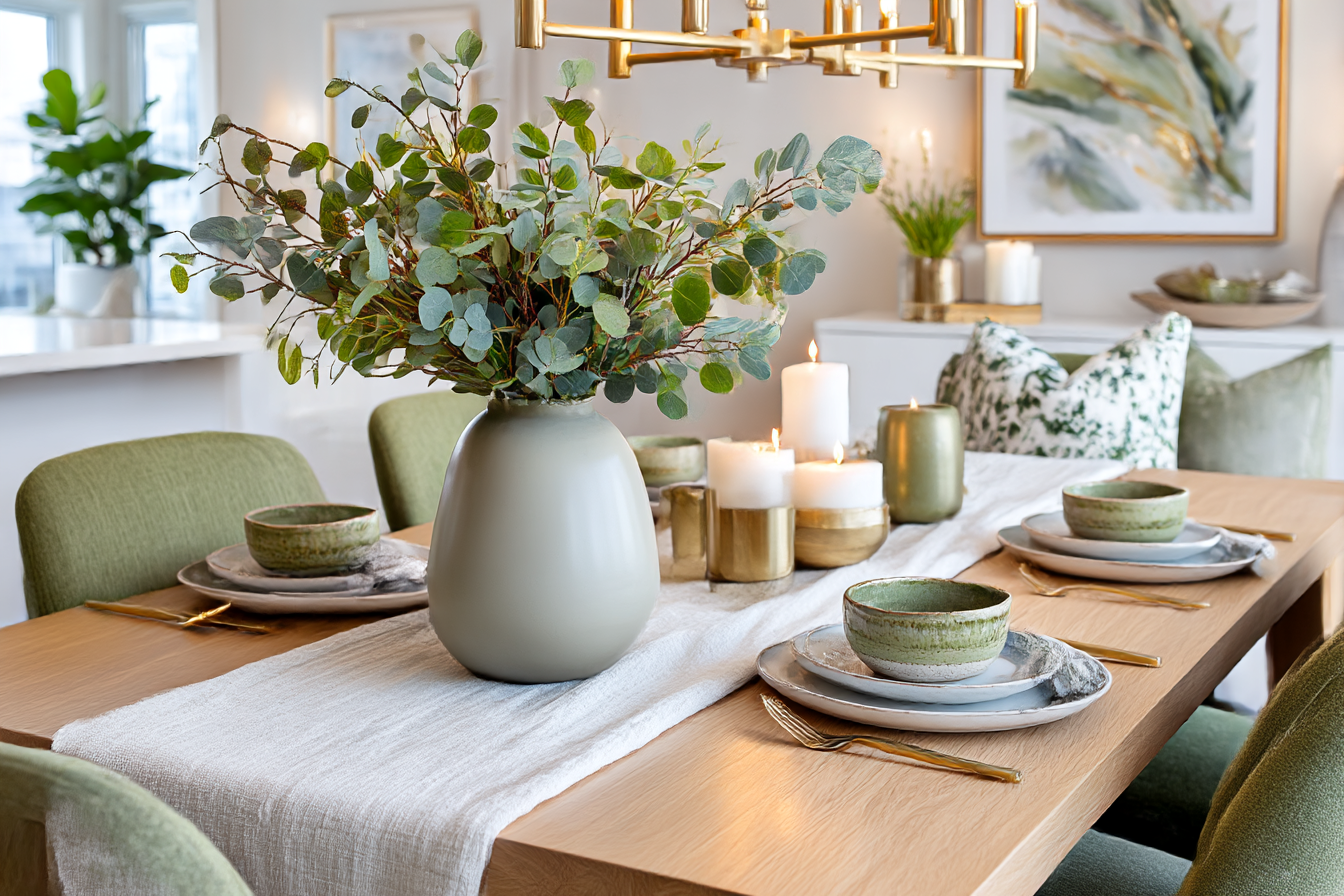
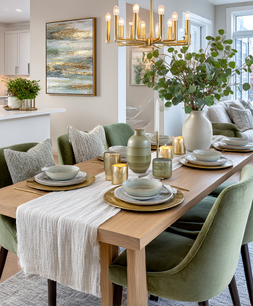
2. Olive Elegance
-
Colours: olive green, brushed brass, soft cream
-
Best for: contemporary spaces with clean lines, oak wood, and natural fabrics
-
Focus colour: olive as the anchor (curtains, accent wall, or a large throw), cream as the calm base, brass as the highlight in lamps, handles, and frames
-
Textures: linen, wool, bouclé, oak, matte ceramics, brushed brass
-
Tips: follow the 60/30/10 rule — 60% cream, 30% olive, 10% brass. Balance the richness of olive with plenty of light neutrals. Use brass sparingly so it adds warmth without overpowering.
-
Seasonal updates: cream and oak can stay all year. For Christmas, layer in darker greens and extra brass. For spring, lighten the olive with sage and bring in soft yellows or white tulips.
-
Try in your home: a cream sofa with an olive throw, brass side lamp, and a few ceramic vases in cream and olive. Add a brass-framed mirror or a console table with olive storage baskets to pull it together.
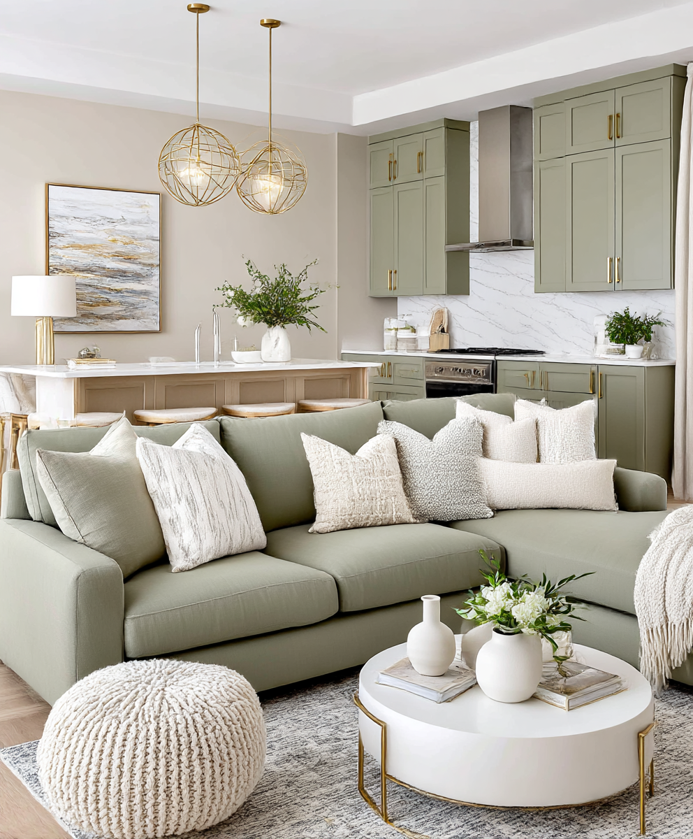
*Olive Elegance* Mood Boards:


Interiors in *Olive Elegance* Colour Palettes:


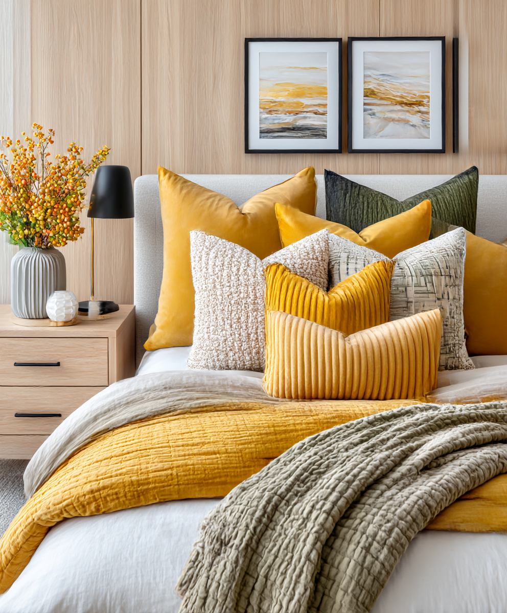
3. Modern Harvest
-
Colours: mustard yellow, olive green, cream, matte black
-
Best for: contemporary spaces with clean lines, light wood and stone
-
Focus colour: olive for curtains or a large throw, mustard as smaller accents
-
Textures: smooth ceramics, brushed cotton, oak, black metal
-
Tips: keep balance with 60% cream, 30% olive, 10% mustard and black
-
Seasonal Updates: cream and black year-round; add brass and deep green for Christmas; straw yellow and white tulips for Easter
-
Try in your home: cream sofa, olive throw, mustard cushions, black side table for grounding
*Modern Harvest* Mood Boards:


Interiors in *Modern Harvest* Colour Palettes:


4. Pumpkin & Rose Glow
-
Colours: dusty rose, pale pumpkin, taupe, soft cream
-
Best for: smaller rooms that need warmth without heaviness
-
Focus colour: taupe as the base, pale pumpkin in throws or ceramics, dusty rose in small touches
-
Textures: washed linen, soft cotton, pale wood
-
Tips: balance one warm tone with two neutrals, add a soft stripe to keep the look relaxed
-
Seasonal Updates: taupe and cream into Christmas with warm white lights and gold; into Easter with mauve and fresh greenery
-
Try in your home: taupe sofa, cream rug, pale pumpkin throw and a dusty rose vase for a soft accent
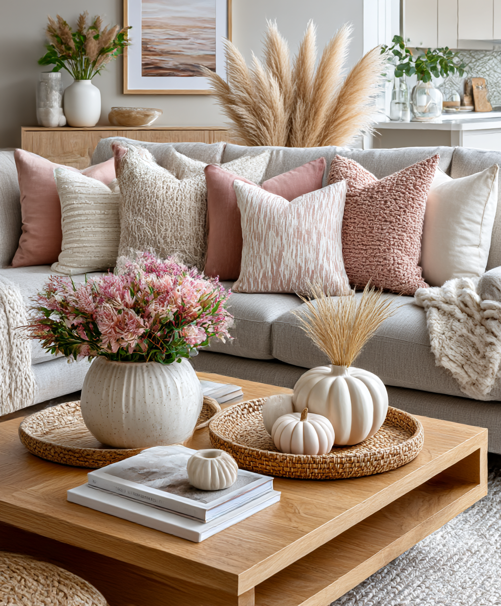
*Pumpkin & Rose Glow* Mood Boards:


Interiors in *Pumpkin & Rose Glow* Colour Palettes:


5. Rustic Harvest
-
Colours: chestnut brown, creamy beige, rusty red
-
Best for: farmhouse touches, wicker, darker woods
-
Focus colour: chestnut in wood furniture, beige on larger areas, rusty red in cushions or throws
-
Textures: jute, wicker, linen, reclaimed wood
-
Tips: layer two neutrals first, then add red in at least three places (cushions, napkins, small vase)
-
Seasonal Updates: chestnut and beige as the base; add forest green and brass at Christmas; soften with peach in spring
-
Try in your home: beige sofa with chestnut pouffe, rusty red cushions, jute rug and wooden shelves
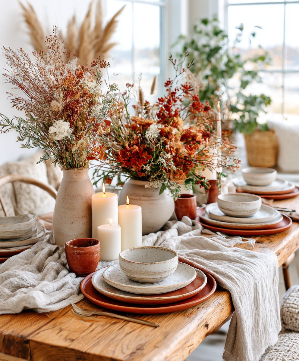
*Rustic Harvest* Mood boards:


Interiors in *Rustic Harvest* Colour Palette:


*Love the colours we are sharing? Use our *Free Colour Picker* tool to help you determine the colour code, and our *Free Paint Calculator* to help you plan wall paint quantity.
For finding similar products featured in our image, use Google Lens, available free to everyone on Google Chrome.
Other Palettes to Try:
- Amber Glow: amber orange, honey yellow, soft beige, warm cream
- Rustic Maple: maple red, burnt sienna, warm taupe, ivory
- Harvest Fields: wheat beige, golden ochre, olive green, warm brown
- Cinnamon Spice: cinnamon brown, terracotta, pumpkin orange, off white
- Soft Chestnut: chestnut brown, dusty clay, pale peach, warm cream
Tip: hold a palette card next to your sofa fabric, flooring and one favourite accessory. If the colours calm the look rather than clash, it’s a good fit.

Decorating Tips for Your Home:
- Begin with what you have: notice your sofa, flooring and wall colour, then choose a palette that flatters them.
- Pick one focus colour: use it on a larger item like a throw, rug or curtains so the eye knows where to land.
- Use the 60/30/10 rule: 60% base neutral, 30% secondary colour, 10% accent. This simple ratio keeps the room balanced.
- Layer textures: start with soft textiles, then add ceramics or glass, finish with candles or foliage.
- Repeat colours: aim to see each colour at least three times – a cushion, a vase and a print – to make the scheme feel intentional.
- Mind the light: north-facing rooms benefit from warmer tones, south-facing can carry cooler neutrals with warm accents.
- Start small: cushions, throws, a table runner or lampshade can shift the feel quickly without a big spend.
- Keep it cohesive: use the same palette across an open-plan space, but vary which colour dominates each zone.
- Think ahead: choose base neutrals you can carry into Christmas and spring. Add or swap accents with the seasons.
- Add atmosphere: scents of cedar, clove or orange and the glow of unscented candles add another layer of comfort.
Share This Post:
Questions & Answers:
How do I pick the right palette?
Match it to fixed features such as your flooring or sofa. Warm floors and beige walls suit Rustic Warmth or Rustic Harvest. Cooler greys or black metal suit Modern Harvest.
Can I mix palettes?
Yes, but keep one neutral and one shared accent colour so the look stays linked.
Should I keep the same palette across my whole home or change it by room?
You can do either. Keeping one palette throughout makes the home feel very cohesive, especially in open-plan spaces. Using slightly different palettes in individual rooms gives each space its own mood, but try to repeat at least one colour across the house so it still feels connected.
Do I need to repaint?
No. Try textiles and art first. Repaint only if the walls clash strongly with your chosen palette.
What if my room is small?
Use lighter bases such as cream and taupe, and keep bolder shades in smaller accents.
How do I keep it budget friendly?
Start with cushion covers, throws and runners. Add one or two statement pieces when ready.
What if my sofa is tricky?
Treat it as your base and build around it with colours that flatter. For grey sofas, add warmth with taupe and rust. For brown sofas, lighten with cream and clay.
How many colours are too many?
Three main colours plus a neutral base are usually enough. Add variety with textures instead of more colour.
Decorating for autumn doesn’t need to be perfect, expensive, or stressful.
It’s about noticing the details that make you feel happy. A colour palette is simply a guide to help you along. Once you find one that feels right, layer in textures and touches of light and scent.
Imagine stepping inside after a chilly walk, wrapping your hands around a hot drink, and settling into a space that feels both calm and alive. With just a few thoughtful choices, such as cushions, throws, or a new artwork, you can create a home that feels welcoming now and adaptable for the seasons ahead.
Share This Post:
Our Services:


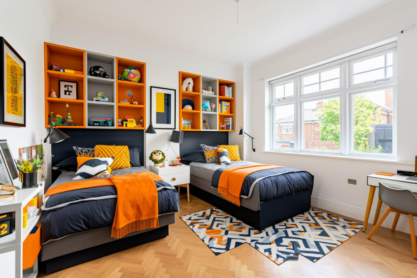


AI-Designed Children’s Bedroom
A child’s bedroom is not just another room in the house. It is where stories are told, where play begins, and where a child feels safe. As a parent, you want to give your child [...]

AI Redesign of a Detached English Home
Walking through my countryside neighborhood the other day, one house really caught my eye. A traditional English home from the 1930s, with so much character in its steep roof and bay windows, but also with [...]

Moor Park Property Restyled with AI
Have you ever walked into a house for sale and felt a spark of excitement, but then struggled to picture how it could truly become your own? Or perhaps you're looking around your current home, [...]

AI Virtual Staging for Real Estate Listings: Rickmansworth Family Home Example
Real estate agents continually seek effective methods to improve property listings and engage potential buyers. This case study demonstrates how AI Virtual Staging, offered by AICI, can be a valuable asset in this effort, especially [...]